Images & Assets
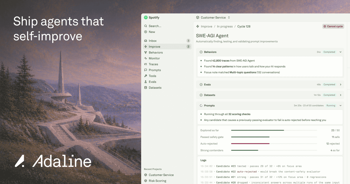
OG Image
Logo
Favicon
 Browser Tab
 Color Palette
#203B14
Primary
#203B14
#203B14
Accent
#203B14
#FBFDF6
Background
#FBFDF6
#0A1D08
Text Primary
#0A1D08
#ECF2DF
Link
#ECF2DF
Typography
Font Families
Heading Inter
Body Akkurat
Font Sizes
H1 53px
H2 30px
Body 18px
Font Stack
Akkurat, Inter, -apple-system, BlinkMacSystemFont, Segoe UI, Roboto, Helvetica Neue, Arial, Noto Sans, sans-serif, Apple Color Emoji, Segoe UI Emoji, Segoe UI Symbol, Noto Color Emoji Components
Button Styles
Spacing & Layout
8px
Base Unit
0px
Border Radius
light
Color Scheme
Brand Personality
Tone
professional
Energy
medium
Target Audience
business professionals
AI Brand Prompt
Use this prompt to recreate a similar website style
STYLE OVERVIEW: This brand embodies Modern Clean and Linear-esque design styles. Professional, clean interface with a focus on readability and functionality. Linear-esque elements are evident in the structured layout and the use of a consistent, geometric design language.
COLOR SYSTEM:
- Primary: #203B14 (dark green) - primary buttons, key UI elements
- Accent: #203B14 (dark green) - secondary buttons, text highlights
- Secondary: #0A1D08 (very dark green) - text, icons
- Background: #FBFDF6 (off-white) - main canvas
- Link: #ECF2DF (light green) - links, interactive elements
TYPOGRAPHY:
- Headings: Inter, 700 weight, 53px for h1, 30px for h2
- Body: Akkurat, 400 weight, 18px base, generous line-height (1.6)
- UI: Akkurat, 14px medium weight for buttons and labels
COMPONENTS:
- Buttons: 20px radius, solid dark green fills for primary, transparent with border for secondary, no shadows
- Cards: Clean borders, subtle shadows, consistent padding
- Inputs: Underlined, dark green focus state, generous padding
VISUAL EFFECTS:
- Subtle hover effects with color shifts
- Clean, geometric layout with structured grids
- Consistent use of rounded corners (20px) for interactive elements
MOOD & AUDIENCE: Professional, trustworthy, and efficient. Appeals to business professionals and developers who value clarity and functionality in their tools. The design conveys a sense of reliability and sophistication.