Images & Assets
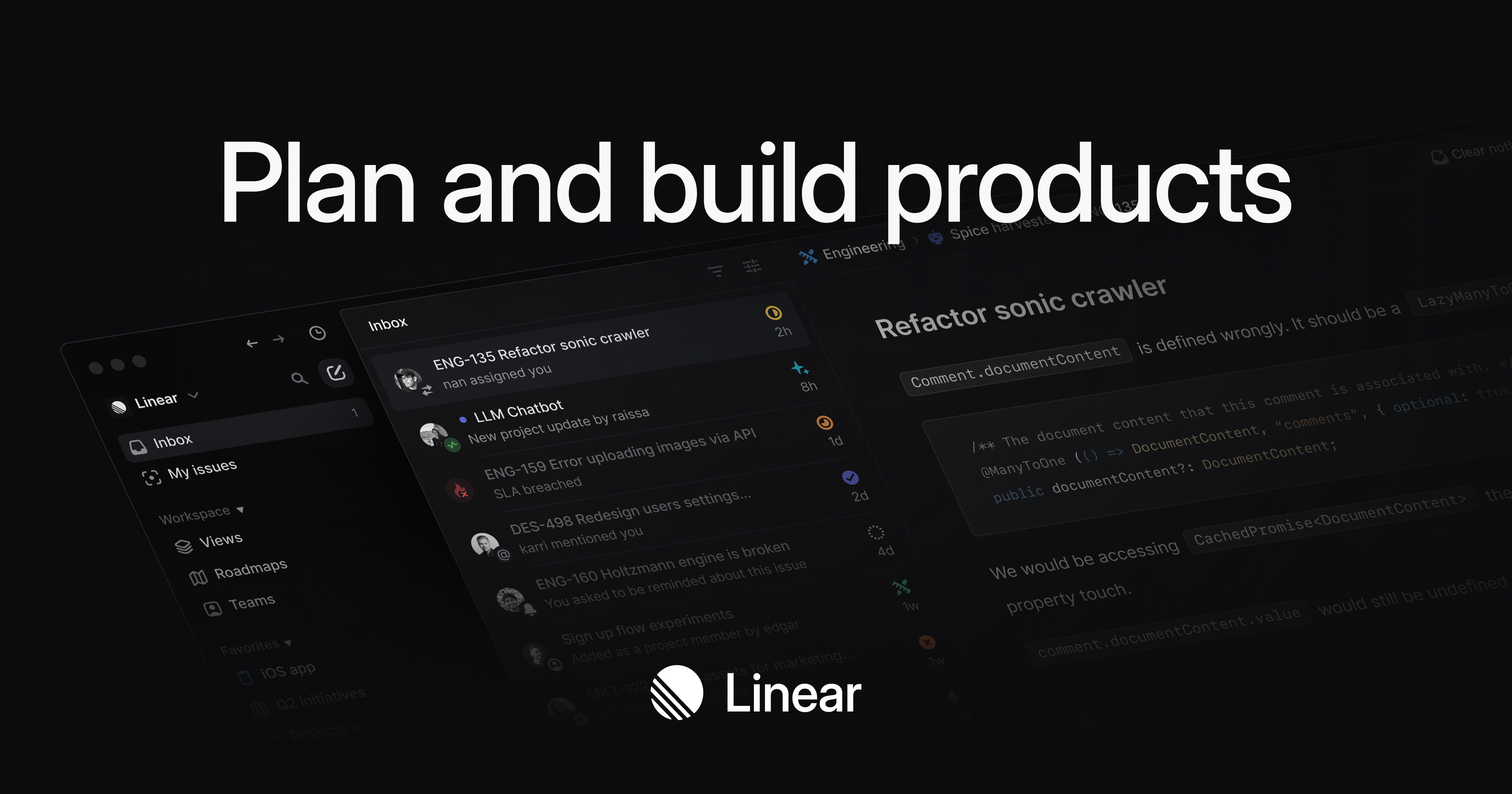
OG Image

Logo
Favicon
Color Palette
#5E6AD2
Primary
#5E6AD2
#A1A7C1
Accent
#A1A7C1
#08090A
Background
#08090A
#F7F8F8
Text Primary
#F7F8F8
#A1A7C1
Link
#A1A7C1
Typography
Font Families
Heading Inter
Body Inter
Font Sizes
H1 64px
H2 56px
Body 17px
Font Stack
Inter, SF Pro Display, -apple-system, BlinkMacSystemFont, Segoe UI, Roboto, Oxygen, Ubuntu, Cantarell, Open Sans, Helvetica Neue, sans-serif Components
Button Styles
Input Border Color #CCCCCC
Input Border Radius 8px
Spacing & Layout
4px
Base Unit
8px
Border Radius
dark
Color Scheme
Brand Personality
Tone
modern
Energy
medium
Target Audience
developers and tech-savvy users
AI Brand Prompt
Use this prompt to recreate a similar website style
Create a website with a Linear-esque and Neo-Brutalism design style, focusing on clean, modern aesthetics with a touch of raw, unpolished elements. The visual approach should emphasize simplicity, functionality, and a strong emphasis on typography. Use a dark color scheme to create a sleek, professional look that appeals to developers and tech-savvy users.
The color palette should include the following hex codes: #5E6AD2 for the primary color, #A1A7C1 for links and accents, #08090A for the background, and #F7F8F8 for primary text. Use the primary color sparingly for key elements like buttons and highlights to maintain a balanced and uncluttered design. The background color should be used extensively to create a cohesive dark theme, while the text color should provide high contrast for readability. Accent colors can be used for hover states and interactive elements to add subtle visual feedback.
For typography, use the Inter font family for all text elements, including headings, body text, and paragraphs. Set the font sizes to 64px for h1, 56px for h2, and 17px for body text. Use regular weight for body text and bold weight for headings to create a clear hierarchy. Ensure that the text is well-spaced and aligned to maintain readability and a clean layout.
UI components should follow a minimalist approach. Buttons should have a flat design with rounded corners and a slight elevation to indicate interactivity. Use the primary color for button backgrounds and the text color for button text. Cards should have a subtle border-radius and a slight shadow to create depth without overwhelming the design. Input fields should be simple and unobtrusive, with a focus on functionality. Borders should be thin and consistent, using the accent color to differentiate between interactive and static elements.
The overall mood of the website should be modern and professional, with a medium energy level that balances sophistication and approachability. The target audience is developers and tech-savvy users, so the design should prioritize usability and clarity. Avoid unnecessary decorations and focus on delivering a streamlined, efficient user experience.